USDA Government Website Redesign
We were tasked with redesigning a government website, the USDA, given their confusing navigation and indirect accessibility to the the site's most visited pages.
Rena Silverman - UX Writer, Designer
Bianca Drevensek - UX/UI Designer
Lorie Saria-Huertas - UX Designer, Researcher


Analysis

The FoodData Central Page -- the most visited page according to analytics--is not accessible through the homepage of USDA.gov. As you can see below, it takes 6 pages to get there!
User Flow

We knew we had to redesign the site so there were less steps to get to the most visited page.
HEURISTIC EVALUATION


Research Plan
At the time of this project, Food Data Central was the top page visited by internet users on the USDA website; therefore, we wanted to understand how users navigate towards that page, as well as food recalls, which were also high up on the list.
We aimed to identify usability issues on the following 2 tasks:
Navigate to FoodData Central from the usda.gov homepage
Navigate to the list of food recalls from the usda.gov homepage

Empathize
Testing Flows
We wanted to see the paths users took to get to the most visited page (FoodDataCentral).

Usability Matrix
The most crucial areas for us to work on were
1. Clear search boxes and
2. excavating important items from a deep and overburdened navigation
Results
After spending several seconds on the homepage, almost all users ended up searching for “FoodData Central” in the search bar. The proper way to get to the FoodData Central from the usda.org site is Our Agency>Agencies>Agricultural Research Service (ARS), Research>Databases and Datasets> Human Nutrition > FoodData Central > Website Pointer for FoodData Central but 0/5 of our users figured it out.
Define

User Persona
Gia Amato is a 34-year-old single mom of one who dislikes rap music, laundry, and single-use plastic, but loves food, friends, and creativity.

Mood Board
Full link here: https://projects.invisionapp.com/boards/ZD3XVV9U4TJ/
Ideate

Top Navigation Analysis

Side Bar Navigation Analysis

Bottom Navigation Analysis
TEST
We tested the navigation on four users: three women and one man, ages 27- 45.

We Asked:
1. What do you expect to find?
2. Who do you think this is meant for?
3. When you scroll down, how do you feel about the navigation both on the side and on the top?
4. And then we asked them to explore.
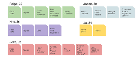
Card Sort
We used card sorting, a technique in user experience design in which a person tests users to generate folksonomy.

Utilities Menu

footer

Footer Updates
Sitemap Redesign
Link to full sitemap here


More Testing
We conducted A/B usability testing using wireframes we created in Sketch and InVision.

Users Tested
We asked users to navigate:
Topics
Category 1
Subcategory 1

Results
We found that Wireframe A was slightly faster to navigate than Wireframe B. Wireframe A took testers approximately 4 seconds, while B took 5 seconds.
Prototype

Style Tile
